Figment was created to be a vibrant art community for creators at Anglo-American University in Prague. Our mission was to engage students from all programs, faculty, and staff in the beauty and power of art through various activities such as art workshops, exhibition visits, and event organization.
We recognized that with limited time in the classroom, many students yearned for more opportunities to learn, practice, and explore their artistic talents. Figment served as a supplement to traditional academic programs, providing a platform for students to gain new experiences and connect with each other on a deeper level.
Our vision was to create an inclusive and collaborative space where students could express themselves creatively, learn new skills, and network with like-minded individuals. With the help of our passionate members, we aimed to organize events and workshops that inspired and empowered students to embrace their unique artistic visions.
We believed that art was a vital part of campus and academic life, and we were excited to promote and celebrate its significance through Figment.
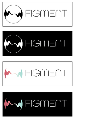
Logo Design
I began the design process for the logo of Figment by exploring various circle design elements, shapes, and typography. During the ideation phase, my goal was to generate multiple concepts and ideas that would result in a visually appealing and meaningful logo that aligned with the art group's vision and values.
To create a unique logo design, I experimented with different circle variations such as overlapping or intersecting circles, incorporating circles into patterns, and using circles to create a distinct symbol. Additionally, typography played a crucial role in the logo design process as it can convey different emotions and messages. Thus, I tested out different font styles and sizes to find typography that matched the art group's personality and style.
After creating several logo design ideas, I evaluated each design's strengths and weaknesses and selected the concept that best represented the art group's identity. As a designer, I also took into account the feedback from the team and made revisions to the chosen design to further refine it.


After collaborating with the team, we agreed to adopt a classic and timeless black and white color palette for the logo. I then made final color adjustments and condensed visual elements to create a clean and memorable logo design. The goal was to simplify the design without losing its identity, ensuring that the logo would be easily recognizable and versatile across various mediums. We were satisfied with the result of the logo and agreed that it accurately represents the brand and can effectively communicate its message to the intended audience.
Final Design

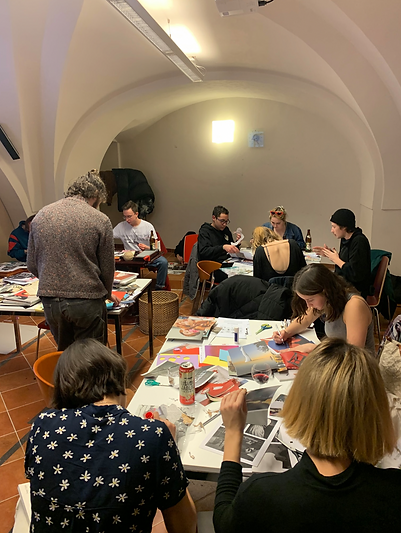
Collage workshop
Our team was delighted to host a collage workshop led by renowned Portuguese artist Francisco Ferreira. This workshop was designed for art students who were keen on learning various collaging techniques and styles. During the workshop, Francisco shared his insights and expertise, inspiring the students to create unique and impressive collages.
Following Francisco's teachings, the students were equipped with the necessary materials and tools to bring their artistic visions to life. Witnessing their creativity and enthusiasm in action was truly inspiring, and we were thrilled with the beautiful and diverse collages they created.